Friday 30 January 2015

STEFAN SAGMEISTER

The contemporary era we currently live in has been made of people who keep pushing the boundaries of art even further.  This is actually true for all eras, cause at what any point in history we are, we always see that innovative designers and artists seem to be pushing beyond the recognisable and at first might be considered as radical.  However when it comes to our present era, we seem to be numb to anything, we have this kind of “been there – done that” attitude.   And yet, designer Stefan Sagmeister came along and has managed to tweak that status quo by pushing the diameters of inspiration that notch further, and made us question what exactly is a designer’s role in society today? 


Born in August 1962, in Bregenz, Austria, Stefan Sagmeister is currently a New York-based graphic designer and lettering artist. Sagmeister co-founded a design firm called Sagmeister & Walsh Inc. with Jessica Walsh in New York City. 


A bit about his past:

Studied gaphic design at the University of Applied Arts in Vienna. 
Received a scholarship to study at the Pratt Institute with took him to New York.
Later moved to Hong Kong to work with Leo Burnett’s Hong Kong Design Group.
Later returned to New York to work with Tibor Kalman's M&Co design company.
Shortly after worked Colours magazine for the Benetton Group in Treviso, Italy.


And set up his New York based company in 1993. Since then he has been designing branding, graphics, and packaging for clients as diverse as the Rolling Stones, HBO, the Guggenheim Museum and Time Warner.


His motto is "Design that needed guts from the creator and still carries the ghost of these guts in the final execution."Sagmeister goes on a one year long vacation around every seven years, where he does not take work from clients.


Sagmeisters work is ingrained in disorienting images and self defining clichés. He can flip into any role with effortless ease. From graphic designer to conceptual typographer to a performance artist just as his mood calls, thus taking him through a cycle which commences the beginning to concept transformation. 


He is most known for the shock event poster which was carved into his naked flesh which was used for the AIGA lecture in 1999.  In 2003 he exhibited a poster called “Sagmeister on a binge” where he took on eating 100 different junk foods which gained him about 25 pounds and took the “before” and “after” pictures of his body.  Using the daily news paper as proof the current date he was at.  


Stefan Sagmeister  has created some very catchy designs for clients including  those for the Rolling Stones and Lou Reed, however he is not one of those mainstream commercial hire designers one can easily get to. Having said that, whatever he gets involved with, he is sure to pour his entire heart and soul into every piece of work. 


And every design he works on feels timeless for the moment and his painstaking attention to the smallest details creates work that offers something new every time one looks at it. 


Bibliography
Heller, S. (2015). Medalist Stefan Sagmeister. Retrieved Jan 29, 2015, from AIGA: http://www.aiga.org/medalist-stefan-sagmeister/
Speaker, T. (2015). Stefan Sagmeister 7 rules for making more happiness. Retrieved Jan 29, 2015, from TED: http://www.ted.com/speakers/stefan_sagmeister
Wikipedia, t. f. (2014, oct 22). Stefan Sagmeister. Retrieved January 2015, 29, from Wikimedia Foundation, Inc: http://en.wikipedia.org/wiki/Stefan_Sagmeister

Thursday 29 January 2015

DAVID CARSON

A man recognised for bending rules and deconstructing legibility from communication.  A man who inspired a whole generation of young designers with his understanding of cultural style. 


Born in September 8, 1954 David Carson is an American graphic designer, art director and also a surfer. His synonymous for his use of experimental typography and as the art director of the magazine Ray Gun.


As the art director of Ray Gun he put to use much of the typographic and layout style.  In the 1990s there was a huge experimental vortex of typography going on and Caron was at its centre. This art was also referred to as "grunge typography".  The flaming pages of Ray Gun impressed the mind of the many who seeked to replicate and unlock the secrets of his new bold style.  Carson was shaping a new way, re defining type, layout and grid.  He represented a new breed of visual author.


Carson  was quite the rebel when it came to following trends and this showed up in his work when he made no use of information hierarch, layouts or typographic patterns nor did he make use of grid formats. However he did explore the possibilities of each spread and subject.  He not only was the art director and designer of the Ray Gun but also for Transworld Skateboarding,  Beach Culture, Surfer, Musician.  His revolutionary layouts always present in every spread.  The kind of setting the page numbers in large display format or enlarging prominent design elements, spacing the letters in the titles frantically across  images.  There was no space for normative sequences. The audience had to figure it out on his own. They had to decipher his messages and this kept them guessing.  It was a bit like a riddle for many. He explored reverse leading, forced extreme justification, no gutter and jamming text columns together. Text set in curved or irregular shapes or filled items. His designs materialised from the meaning of the words and gave them a whole deal of attention. Thus ultimately trying to achieve harmony.


Carson quotes:  “It’s the basic decisions—images, cropping and appropriate font and design choices—that make design work, not having the ability to overlap or play with opacity.”


The early 1990s, saw the advent of digital tools such as the computer.  Designers  had the ability to manipulate form directly in real time action. Some of the programs used at the time were QuarkXPress and PageMaker, both Carson’s primary medium of visual authorship. It allowed him to work faster and to experiment with more things in a shorter time. These new aids enabled also helped with the creation of “mistakes” which many a time are the way to experiment further on work by turning an accident into a master piece. However this was no magic pill and nor did it instil instant talent.  To quote, Cason say:   “It’s the basic decisions—images, cropping and appropriate font and design choices—that make design work, not having the ability to overlap or play with opacity.”

As it goes in this life, his legendary disregard for readability conventions has made him a hero to many and to some others, an agent of ugly.  I am not one of those latter ones. 


Bibliography

Lupton, E. (2015). David Carson. Retrieved January 29, 2015, from AIGA | the professional association for design: http://www.aiga.org/medalist-david-carson/
Meggs, P. B., & Purvis, A. W. (2012). Meggs’ History of Graphic Design (Fifth ed.). Hoboken, New Jersey: John Wiley & Sons, Inc.
Wikipedia, t. f. (2015, January 13). David Carson . Retrieved January 2015, 29, from Wikimedia Foundation, Inc: http://en.wikipedia.org/wiki/David_Carson_(graphic_designer)


Wednesday 28 January 2015

POP ART (1950s – 1970s)

Pop Art was born in Britain during the mid 1950,s. It was the inspiration of a group of young rebellious artists - as most modern art tends to be. The first appearance of the term Pop Art occurred during discussions among artists who called themselves the Independent Group, which was part of the Institute of Contemporary Art in London, begun around 1952-53. Towards the late 1950s it started to emerge also in the United States of America.
The world of Pop Art tries to embrace what people want.  It welcomes popular culture or sometimes also referred to as “material culture”.  It doesn’t stand there and criticise the consequences of materialism and consumerism. It just simply recognises its persistent presence as a natural occurrence.  As a fact!


After the second world war, the youth of the time wanted to express their optimism after so much hardship and privation buy creating a youthful visual language. Colour was to be fundamental to all this.  A means of brighten up what was a very dull time in history. They turned to clever advertisements and building more on the effective means of mass communication.  Which at the time consisted of films, TV, newspapers and magazines.
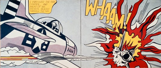
Pop art on the other hand, presented a challenge to traditions of fine art.   In pop art,  recognisable material is sometimes visually removed from its known context, isolated, and/or combined with unrelated material.  However, what wasn’t very well understood by the previous generations was that the concept of pop art consisting much to the art itself, but more as to the attitudes that led to it and later on what it led.


Pop Art is commonly interpreted as a response to the then-dominant ideas of abstract expressionism.  Its use of objects and images have similarities to Dada. Pop art is aimed to employ images of popular as opposed to exclusive culture in art, emphasizing the banal or kitsch elements of any given culture, most often through the use of irony.  It also made use of mechanical means of reproduction or rendering techniques of the time. Thus sometimes exaggerating the pixilation’s and dots.


Key Characteristics of Pop Art:

Familiar imagery, derived from popular media and products.
Flat imagery influenced by comic books and newspaper photographs.
Usually very bright colours.
Images of celebrities or fictional characters in comic books, advertisements and fan magazines.


Pop art frequently takes as its imagery that which is currently in use in advertising. Product labelling and logos figure prominently in the imagery chosen by pop artists, like in the Campbell's Soup Cans labels, by Andy Warhol. Warhol also took this concept also to the shipping box containing retail items like the Campbell’s Tomato Juice Box and also Brillo Soap box sculptures.


Pop art made its way to being associated with the work of New York artists of the early 1960s such as Andy Warhol, Roy Lichtenstein, James Rosenquist, and Claes Oldenburg, (all heavy weights to this art) but artists who drew on popular imagery were part of a world wide phenomenon in various cities from the mid 1950s onwards.


By following  in the footsteps and popularity of the Abstract Expressionists, Pop's reintroduction of recognisable imagery was a major shift for the direction of modernism. Pop artists celebrated everyday objects and people in subject of that point in time. This was it seeked to promote popular culture to the level of fine art. Perhaps owing to the incorporation of commercial images, Pop art has become one of the most recognizable styles of modern art.


Bibliography

ArtHistory.net. (2013-2014 Bitter Soup LLC). ArtHistory.net. Retrieved January 25, 2015, from http://arthistory.about.com/od/modernarthistory/a/Pop-Art-Art-History-101-Basics.htm
Foundation, J. W. (2015). Pop Art . Retrieved January 28, 2015, from The Art Story.org: http://www.theartstory.org/movement-pop-art.htm

Wikipedia, t. f. (2015, January 15). Pop Art. Retrieved January 2015, 25, from Wikimedia Foundation, Inc: http://en.wikipedia.org/wiki/Pop_art

Tuesday 27 January 2015

SAUL BASS (1920 –1996)

Saul Bass was an American graphic designer and Academy Award winning filmmaker, which at some point or another we always come by his work.  It might be a bit cliché, but Saul Bass really has done it all. He is known for design, films, packaging, architecture, branding & corporate identity, graphics, and movie posters. His work surrounds us.
During his 40-year career Bass worked for some of Hollywood's most prominent filmmakers, including Alfred Hitchcock, Otto Preminger, Billy Wilder, Stanley Kubrick and Martin Scorsese.


Some of his most distinguished design works are corporate logos in North America, including the Bell System logo in 1969, as well as AT&T's globe logo in 1983 after the breakup of the Bell System. He also designed Continental Airlines' 1968 jet stream logo and United Airlines' 1974 tulip logo, which became some of the most recognized airline industry logos of the era.


Although born in the Bronx, New York City and studied Arts in Manhattan and Brooklyn, he made the move to Hollywood in California back in the mid 1940s were he designing print adverts for films including Champion (1949), Death of a Salesman (1951) and The Moon is Blue (1953), directed by Otto Preminger which made him widely known. His next collaboration with Preminger was to design a film poster for his 1954 film Carmen Jones. Preminger was so impressed with Bass's work that he asked him to produce the title sequence as well. This was when Bass first saw the opportunity to create a title sequence which would ultimately enhance the experience of the audience and contribute to the mood and the theme of the movie within the opening moments. Bass was one of the first to understand the creative potential of the opening and closing credits of a movie.
Saul Bass became commonly known in the film industry after he created the title sequence for Otto Preminger's The Man with the Golden Arm (1955). The film was about a jazz musician and his struggle with heroin addiction. He created an original title sequence to match the film's controversial subject. He chose the arm as the central image, as it is a strong image relating to heroin addiction.


What really put him on the charts however, where the works he did for Alfred Hitchcock. These where to be the more memorable title sequences, as he invented a new kind of typography for each different movie.  This was revolutionary work as before the title sequences back in the 1950s were generally static and apart from the movie.  They didn’t tie into the style.  Bass once described his main goal for his title sequences as being to ‘’try to reach for a simple, visual phrase that tells you what the picture is all about and evokes the essence of the story”.  He wanted to make the audiences also see familiar parts of their world in an unfamiliar way.


He designed title sequences for more than 40 years, and employed diverse film making techniques, from cut-out animation for Anatomy of a Murder (1958), to fully animated mini-movies such as the epilogue for Around the World in 80 Days (1956), and live action sequences.   He is known and worked on other great projects such as the title sequence to Grand Prix (1966) portrays the moments before the opening race in Monte Carlo which was very innovative for that time.


Toward the end of his career he worked with great names by the likes of James L. Brooks and Martin Scorsese.  With Martin Scorsese he started to make use of new techniques that he pioneered and moved into the use of computerised effects. Bass’s title sequences featured new and innovative methods of production and startling graphic design.  He had a long and prolific carrier and made many works which we are all familiar with and although his record is wide, thoughtful and deep, it is a prologue: to what's surely to come, and to the man himself.


Bibliography

Meggs, P. B., & Purvis, A. W. (2012). Meggs’ History of Graphic Design (Fifth ed.). Hoboken, New Jersey: John Wiley & Sons, Inc.
Wikipedia, t. f. (8, December 2014). Saul Bass. Retrieved January 2015, 24, from Wikimedia Foundation, Inc: http://en.wikipedia.org/wiki/Saul_Bass

Monday 26 January 2015

THE NEW YORK SCHOOL

During a time where many Europeans aimed at escaping from the total political authority  hold over  society and countries effected by the two great wars, they sought refuge and a new life across the Atlantic in America. Along with all their costumes many also introduced Americans to European avant-garde way of living.

Round about  the 1940s America made its move towards the modernist era of design adding however new forms and concepts.  Where European design most mainly complex and theoretical, American design sought at being more intuitive, practical and had less of a formal approach when it came to organising space.  New York being the focal destination for experimentation of artistry of the mid twentieth century. It nurtured creativity and individuals of great talent and helped them to achieve their full potential.


One of the most influential Pioneers of the New York School more than any other Native American Designer, was Paul Rand (1914-1996).  He initiated the American advance to modern design.  From a young age he started as a editorial designer for many big name magazines which had a huge spread and print volume. He derived knowledge from modern movement names such as Kandinsky, Klee and the cubists, which gave him a better understanding that freely invented shapes could have a self-contained life, both symbolic and expressive.   A magazine cover symbolic of his work is that of Direction Magazine from December 1940, where he utilized red dots with an ambiguous symbolic message.


Rand sometimes used physical visual contrast which portayed his work. He played red against green, organic shape against geometric type, photographic tone against flat colour, cut or torn edges against sharp forms, and the textural pattern of type against white.  Rand took risks by searching unproven ideas. In addition, he understood the value of ordinary, universally understood signs and symbols as tools for translating ideas into visual communications. To visually engage the audience effectively and communicate memorably, he knew that the designer needed to alter and contrast signs and symbols. A reinterpretation of the message was sometimes necessary to make the ordinary into something extraordinary.


 The art of the New York School was a place of play for the futurist concept. With all his visual resourcefulness, Rand brought about a distinct design and the integration of form and function for effective communication. The educational role of the designer was to upgrade rather than serve the least common denominator of public taste. During the early period of Rand’s career, he made forays into the vocabulary of modern art but never parted from an immediate accessibility of image.


Paul Rand’s use of shape and asymmetrical balance during the 1940s was an important inspiration for Saul Bass. The sensibilities of the New York school were then taken to Los Angeles by Saul Bass (1919–96).  Saul Bass’s frequently reduced contrasts of shape, colour, and texture in his designs to a single dominant image. Bass had an outstanding ability to convey the basis of a design with images that become glyphs, or elemental pictorial signs that exert great graphic power.


Bibliography

Meggs, P. B., & Purvis, A. W. (2012). Meggs’ History of Graphic Design (Fifth ed.). Hoboken, New Jersey: John Wiley & Sons, Inc.